# css2布局
# 圣杯布局
html
<div class="container">
    <!-- 中间提前需要提前加载 -->
    <div class="middle">中</div>
    <div class="left"><p>this is left</p></div>
    <div class="right">右</div>
</div>
2
3
4
5
6
css
<style>
    .left {
        width: 300px;
        float: left;
        background-color: red;
        margin-left: -100%;
        position: relative;
        left: -300px;
    }
    .right {
        width: 300px;
        float: left;
        background-color: blue;
        margin-left: -300px;
        position: relative;
        left: 300px;
    }
    .middle {
        width: 100%;
        background-color: yellow;
        float: left;
    }
    .container {
        padding: 0 300px;
        overflow: hidden;
    }
    .left,.middle,.right {
        padding-bottom: 9999px;
        margin-bottom: -9999px;

    }
</style>
2
3
4
5
6
7
8
9
10
11
12
13
14
15
16
17
18
19
20
21
22
23
24
25
26
27
28
29
30
31
32
# 双飞翼布局
margin不改变盒子模型 html
<div class="container">
    <!-- 中间提前需要提前加载 -->
    <div class="middle">
        <div class="inner">中</div>
    </div>
    <div class="left">
        <p>this is left</p>
    </div>
    <div class="right">右</div>
</div>
2
3
4
5
6
7
8
9
10
css
<style>
    .left {
        width: 300px;
        float: left;
        background-color: red;
        margin-left: -100%;
    }
    .right {
        width: 300px;
        float: left;
        background-color: blue;
        margin-left: -300px;
    }
    .middle {
        width: 100%;
        background-color: yellow;
        float: left;
    }
    /* margin不改变盒子模型 */
    .middle .inner {
        margin-left: 300px;
        margin-right: 300px;
    }
    .container {
        overflow: hidden;
    }
    .left,.middle,.right {
        padding-bottom: 9999px;
        margin-bottom: -9999px;
    }
</style>
2
3
4
5
6
7
8
9
10
11
12
13
14
15
16
17
18
19
20
21
22
23
24
25
26
27
28
29
30
31
# 弹性盒模型与Reset的选择
flex模型
*的杀伤力太大!!!
Reset.css 重置 Normalize.css修复 Neat.css融合 http://thx.github.io/cube/doc/neat
html{box-sizing: border-box;} ,:before,X:after{box-sizing: inherit;}
# ICON-FONT与常用字体排版
CSS ICON http://cssicon.space/#/
# CSS HINK
1.不要使用多个class选择元素,如a.foo.boo,这在ie6及以下不能正确解析 2.移除空的css规则,如a{} 3.正确的使用显示属性,如display:inline不要和width,height,float,margin,padding同时使用,display:inline-block不要和float同时使用等 4.避免过多的浮动,当浮动次数超过十次时,会显示警告 5.避免使用过多的字号,当字号声明超过十种时,显示警告 6.避免使用过多web字体,当使用超过五次时,显示警告 7.避免使用id作为样式选择器 8.标题元素只定义一次 9.使用width:100%时要小心 10.属性值为0时不要写单位 11.各浏览器专属的css属性要有规范, 例如.foo{-moz-border-radius:5px;border-radius:5px} 12.避免使用看起来像正则表达式的css3选择器 13.遵守盒模型规则
# BFC IFC GFC FFC
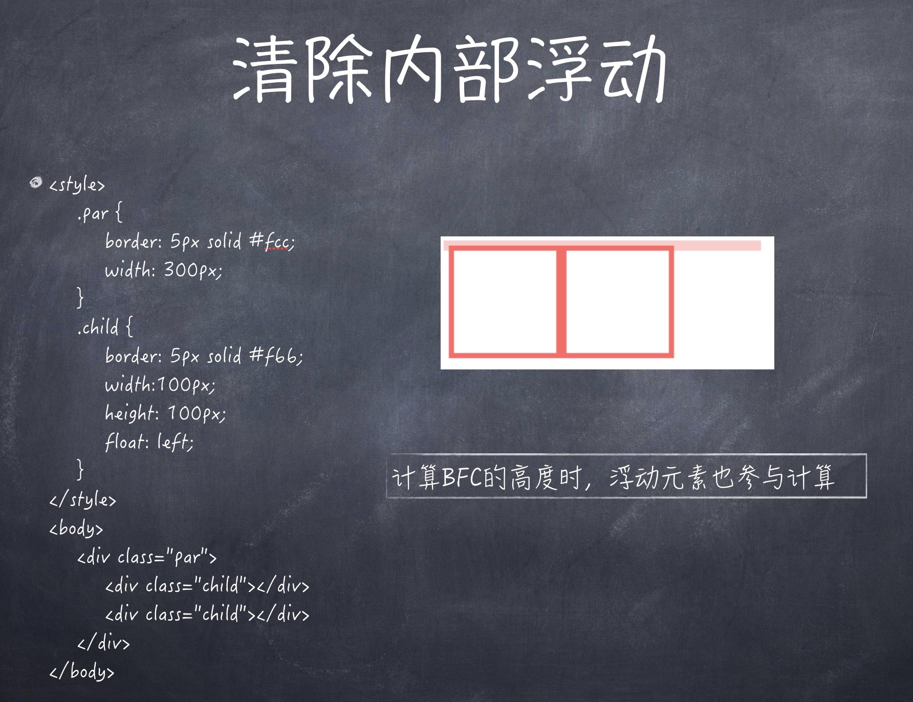
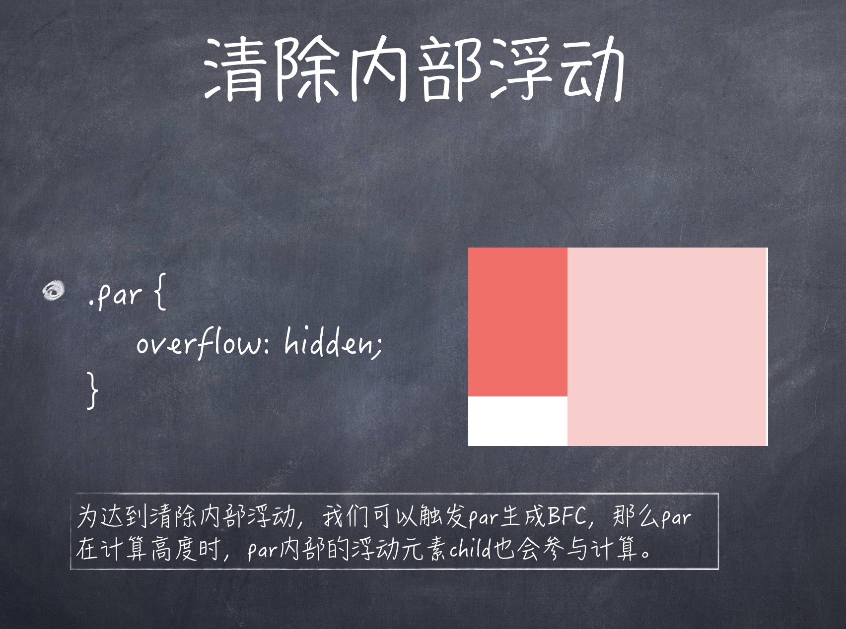
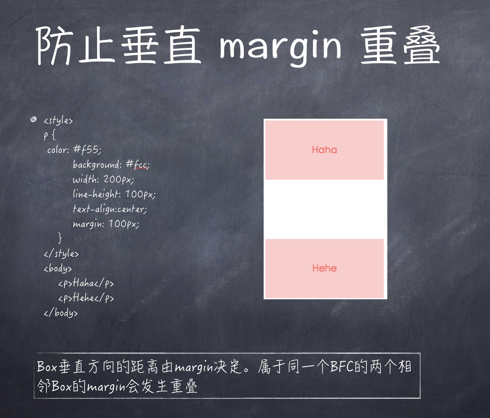
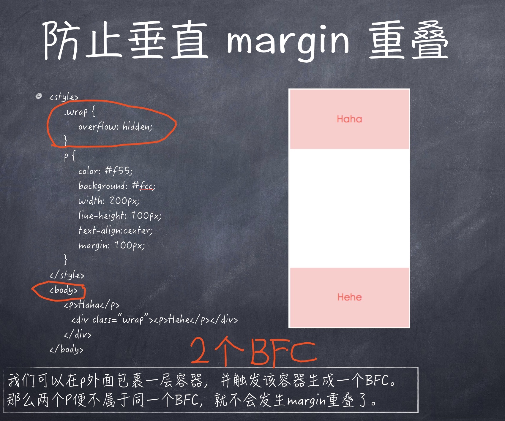
BFC(Block Formatting Context)格式化上下文,是Web页面中盒模型布局的CSS渲染模式,指一个独立的渲染区域或者说是一个隔离的独立容器。 Box: CSS布局的基本单位 Box 是 CSS 布局的对象和基本单位, 直观点来说,就是一个页面是由很多个 Box 组成的。元素的类型和 display 属性,决定了这个 Box 的类型。 不同类型的 Box, 会参与不同的 Formatting Context(一个决定如何渲染文档的容器),因此Box内的元素会以不同的方式渲染。让我们看看有哪些盒子: block-level box:display 属性为 block, list-item, table 的元素,会生成 block-level box。并且参与 block fomatting context; inline-level box:display 属性为 inline, inline-block, inline-table 的元素,会生成 inline-level box。并且参与 inline formatting context; Formatting context 是 W3C CSS2.1 规范中的一个概念。它是页面中的一块渲染区域,并且有一套渲染规则,它决定了其子元素将如何定位,以及和其他元素的关系和相互作用。最常见的 Formatting context 有 Block fomatting context (简称BFC)和 Inline formatting context (简称IFC)。
哪些元素会生成BFC? 根元素 float属性不为none position为absolute或fixed display为inline-block, table-cell, table-caption, flex, inline-flex overflow不为visible
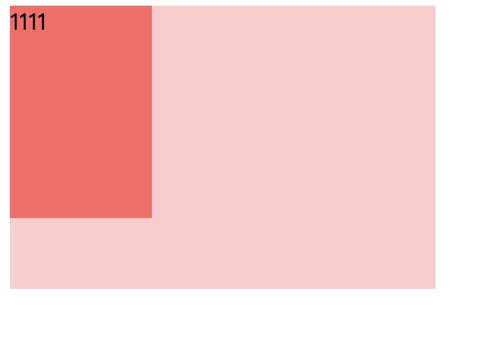
<style>
    body {
        width: 300px;
        position: relative;
    }

    .aside {
        width: 100px;
        height: 150px;
        float: left;
        background: #f66;
    }

    .main {
        height: 200px;
        background: #fcc;
    }
</style>

<body>
    <div class="aside">1111</div>
    <div class="main"></div>
</body>
2
3
4
5
6
7
8
9
10
11
12
13
14
15
16
17
18
19
20
21
22
23
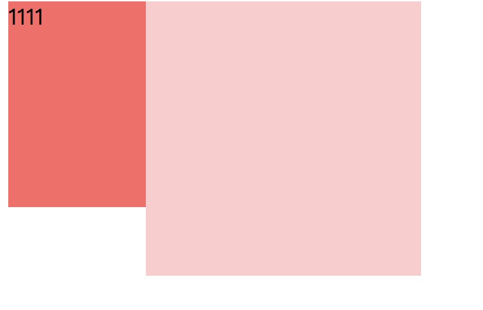
overflow: hidden;形成bfc
.main {
    height: 200px;
    background: #fcc;
    overflow: hidden;
}
2
3
4
5
# 总结
其实以上的几个例子都体现了,BFC就是页面上的一个隔离的独立容器,容器里面的子元素不会影响到外面的元素。反之也如此。 IFC(Inline Formatting Contexts)直译为"内联格式化上下文",IFC的line box(线框)高度由其包含行内元素中最高的实际高度计算而来(不受到竖直方向的padding/margin影响) FFC(Flex Formatting Contexts)直译为"自适应格式化上下文",display值为flex或者inline-flex的元素将会生成自适应容器(flex container), GFC(GridLayout Formatting Contexts)直译为"网格布局格式化上下文",当为一个元素设置display值为grid的时候,此元素将会获得一个独立的渲染区域,我们可以通过在网格容器(grid container)上定义网格定义行(grid definition rows)和网格定义列(grid definition columns)属性各在网格项目(grid item)上定义网格行(grid row)和网格列(grid columns)为每一个网格项目(grid item)定义位置和空间。
← CSS3构造3D世界 OO CSS →